Basic exercises for using matplotlib
by B. H. K. Yung
Workshop on: "Python and astro-statistics",
Institute of Physics NCU, Toruń
27-30 June, 2016
Question 1
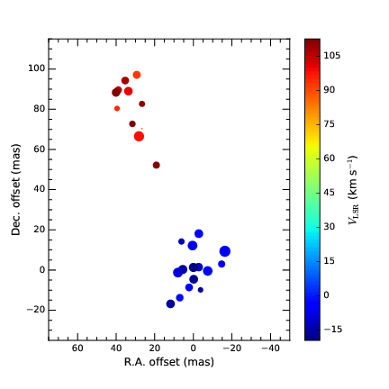
Plot the given fake H$_{2}$O maser VLBI map data (data_VLBI-map.dat). There are four columns in the file. Columns 1 and 2 give the offset positions (R.A. offset and Dec. offset) of the maser features with respect to an arbitrary point in milliarseconds (mas). Columns 3 and 4 give the local-standard-of-rest velocity, $V_{\rm LSR}$, in km s$^{-1}$, and the peak flux in Jy, for each maser feature. The sizes of the markers plotted are to be proportional to the fluxes.
Hints: In addition to the common commands, you may wish to look up for the following functions or keywords.
- scatter(), cmap
- colorbar(), set_label()
- set_xlabel(), set_ylabel()
- tick_params()
- minorticks_on()
Question 2
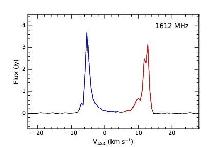
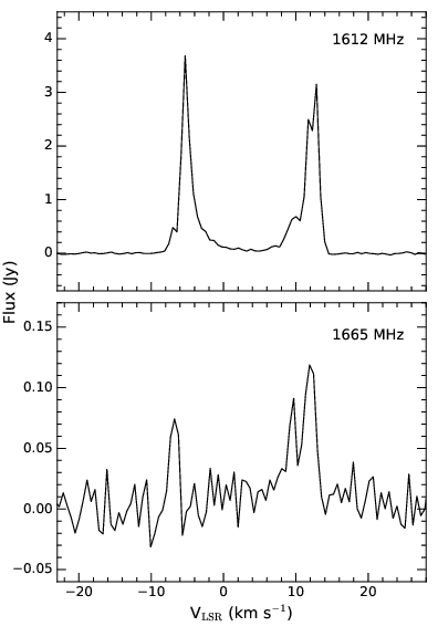
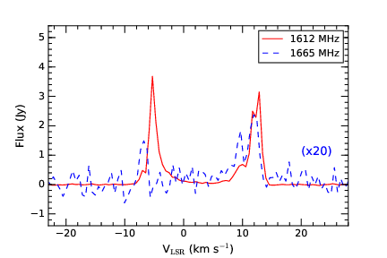
Plot the given real baseline-subtracted spectra of OH maser (in 1612 and 1665 MHz) in three different ways. The two columns of the file give the $V_{\rm LSR}$ and flux in Jy for each spectral channel.
(a) Plot the 1612 MHz spectrum only (data_1612-spec.dat). The baseline root-mean-square (rms) noise of this spectrum is 0.01 Jy. Indicate the blue- and red- shifted peaks with the corresponding colours, and the rest of the spectral curve in black. For simplicity, consider the following conditions for this particular scenario.
- Only the line features with fluxes larger than or equal to 3 times the rms (i.e. 3$\sigma$) are real emission features which require shading in blue or red.
- The systemic velocity of the object is found to be 4 km s$^{-1}$, so the line features with $V_{\rm LSR}$ < 4 km s$^{-1}$ are considered as blue-shifted, while those with $V_{\rm LSR}$ > 4 km s$^{-1}$ are red-shifted.
Hints: You may have to use the if and else statements and the text() function.
(b) Plot the 1612 and 1665 MHz (data_1665-spec.dat) spectra in two subplots, with the 1612 MHz one above. The two spectra should share the velocity axis.
(c) Plot both the 1612 and 1665 MHz lines in one panel, but with different colours. The weaker 1665 MHz line is needed to be scale up by a certain factor (e.g., 20) for proper display.
Question 3
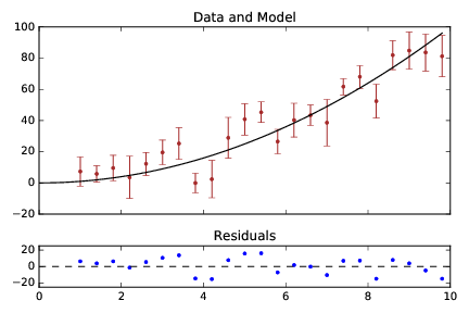
Plot the fake data and model curve (data_power2.dat) together with the error bars. Add a residual plot in another panel below. The model curve is assumed to be $y=x^{2}$.
Hints: You may have to use the following functions.
- GridSpec()
- add_subplot()
- errorbar()
- set_xticklabels()
- set_yticks()
- set_title()
